En 1986, le fue encomendado al artista visual Steve Rude el ilustrar una historia corta para el comic de licencia “Jonny Quest”. Cuando decide mandarle muestras de su trabajo por fax al maestro narrador Alex Toth (1928-2006) y recibir su opinión al respecto, su respuesta fue tanto kilométrica como minuciosa, una crítica en más de 20 páginas a la obra de un colega que se podría catalogar hasta de injusta y para quien en ese momento hacía sus pininos en la industria.
Sin duda alguna fue una anécdota célebre y de la cual corre mucha tinta y JPGs en el Internet, y que el propio Rude decidió difundirla y desestimarla bajo sus propios términos. Es Alex Toth. Genio y figura. Qué más da, ¿no?
Quizás. Lo más interesante en mi opinión de esta amplia misiva son las últimas dos páginas, las cuales incluso se pueden sacar de su contexto (los comics) y ponerlas en otros ámbitos de las artes: el cine, la pintura, fotografía, literatura, lo que sea. El leer todas estas líneas son para mí una serie de consejos—no, más bien instrucciones—sumamente enérgicas, elocuentes e inspiradoras. Un juramento, un checklist, un recetario, un manual de uso fundamental para aspirantes o profesionales que buscan llamarse a sí mismos ARTISTAS.
Palabras para enmarcar. Read on.
– – – – – – – – – –
If you didn’t have talent, I wouldn’t give you .5 minutes’ sweat at this, Steve—but I think you’ve cheated and faked your way through this whole story! As if you didn’t care enough to think any of it through!
A few welldrawn figures in 12 pages, doesn’t cut it, kiddo! Since you asked, I gave you the critique—if you’re pissed, I’m sorry! But I’m dismayed that you don’t concern yourself with what is vital/important to any story you do, to do it right—or not do it at all!
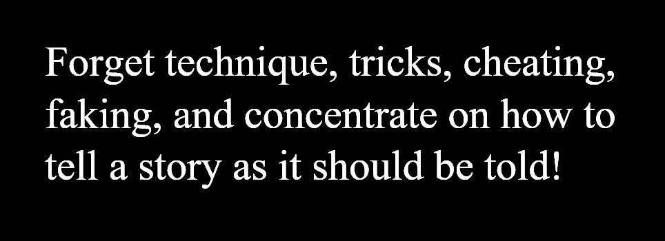
Forget technique, tricks, cheating, faking, and concentrate on how to tell a story as it should be told!
Clarify! Reveal! Don’t conceal! Don’t confuse! Show! Explain! Simplify! Economize! Open up areas! Don’t clutter! For God’s sake, if you don’t know about a subject you must draw, then find out! You’ll learn! So will your readers! Once drawn, you’ll keep memory of it—so, years later, you’ll recall it, if need be—photos help document/authenticate subjects, people, places, things, and we’re swarming with sources for such info—there’s no excuse for not using it—camels and palm trees and ‘copters and deserts and costumes are infinitely varied—their differing types provides you with pictorial fun and interest—ditto your readers! Use it! Learn!
Think! Think! Think!
—before you draw—while you draw—and after—and redraw, if it doesn’t work—be honest, with yourself! And your readers! Stop faking! You don’t know enough to do it well, so don’t! Learn! See! Observe!
I’m old fashioned, but I don’t comprehend your (and too many other young cartoonists’) disdain for designing all your captions and dialogue balloons’ exact shape/size/positions in every panel and page—and, clearly, pencilling-in legible readable copy!?
I always did, and do—as did most of my generation of crocks! You’re missing half the fun (and all of the responsibility!) by throwing that part of your job away, too! Copy, in strips, as in all graphic/aural media, is of vital importance, and part of overall design! It controls your reader’s eyeflow, through your panels, up, dow, around, and pages! Why fob it off on a letterer who’ll care less, know less, about such vital components and who may just mess it up more? I Don’t get it!
The logo (title) placement’s very important, too, and if you’re given a ‘Jonny Quest’ stat for pasteup, or design your own, plus the story (episode) title, that’s your job!
You’ve played fast and loose with this too! Disappointing! You don’t care!
Or do you?
As it is, I don’t see our title here ‘Jonny Quest’ in all of this splash page—just the backview of a kid who ‘might’ be him, unimportantly sized and positioned and posed—for a first-time reader to see this page, he’d wonder which character was the hero?
You give more importance to an incidental character in Panel 2, than Jonny in the splash? Why? And who’s the guy in the bg? Study staging, in films/tv/and yes, the stage!
And remember!
And keep doing that all your productive life!
Always be a student! A scholar! Admitting to how little you know, how much there’s still left to learn, is your key to learning! For a lifetime!
Study everything! Be curious/interested/in everything. You may have to draw it someday! You can’t draw something credibly until/unless you do/can understand it! And vice versa!
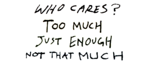
Comic books print the worst junk art! 99% of it is cheap, vulgar, ignorant, ugly, senseless, fakery and trickery of characterless hue—if that’s all you want, just do what you’re doing—you’ll be a mite better than the rest, but that won’t be much!
Your growth is in your hands, not mine!
I hate giving critiques—an emotional drain! They anger me! And those I critique! Like you! If you’re angry—don’t waste it on me! Be angry with you! You are in your own hands, like clay, waiting to be formed—you must always be your own best teacher! Not me! I Refuse that—unless I hold classes!
No old pro, no teacher, no school, no book, no how-to film/cassette will ever teach you as well as you can and must. But they help you to think!
To do that, you must be aware! Not smug, or complacent, or cocky, or relaxed, about how good you are! You’ve used 10% of your thinking skills thus far—you’ve got 90% left! For the rest of your career and life! How much of it will you use?
Forget all the fandom bullshit and kudos and hype and cons’ groupies’ adulation—and be true to yourself and your long road ahead to the top, or to wherever you want to go—and don’t let ego stop you from learning to do better, best!
That’s all, kiddo! Study our old masters of art, sculpture, illustration, strips, film, of the last 100 years and beyond, here and abroad!


